NPR tiny desk concerts
The Challenge
NPR’s Tiny Desk Concerts hosts artists for taped live performances at the desk of former All Songs Considered host Bob Boilen. After 16 years, the video series needs a branding refresh, from opening animation to print logo, to be palatable to a wide audience and continue connecting through music.
-
DESIGN | Kendall Gathas
ANIMATION | Kendall Gathas -
WORK | Branding
CLIENT | NPR Music
PRODUCED AT | Ringling College of Art and Design
Research
Tiny Desk Concerts
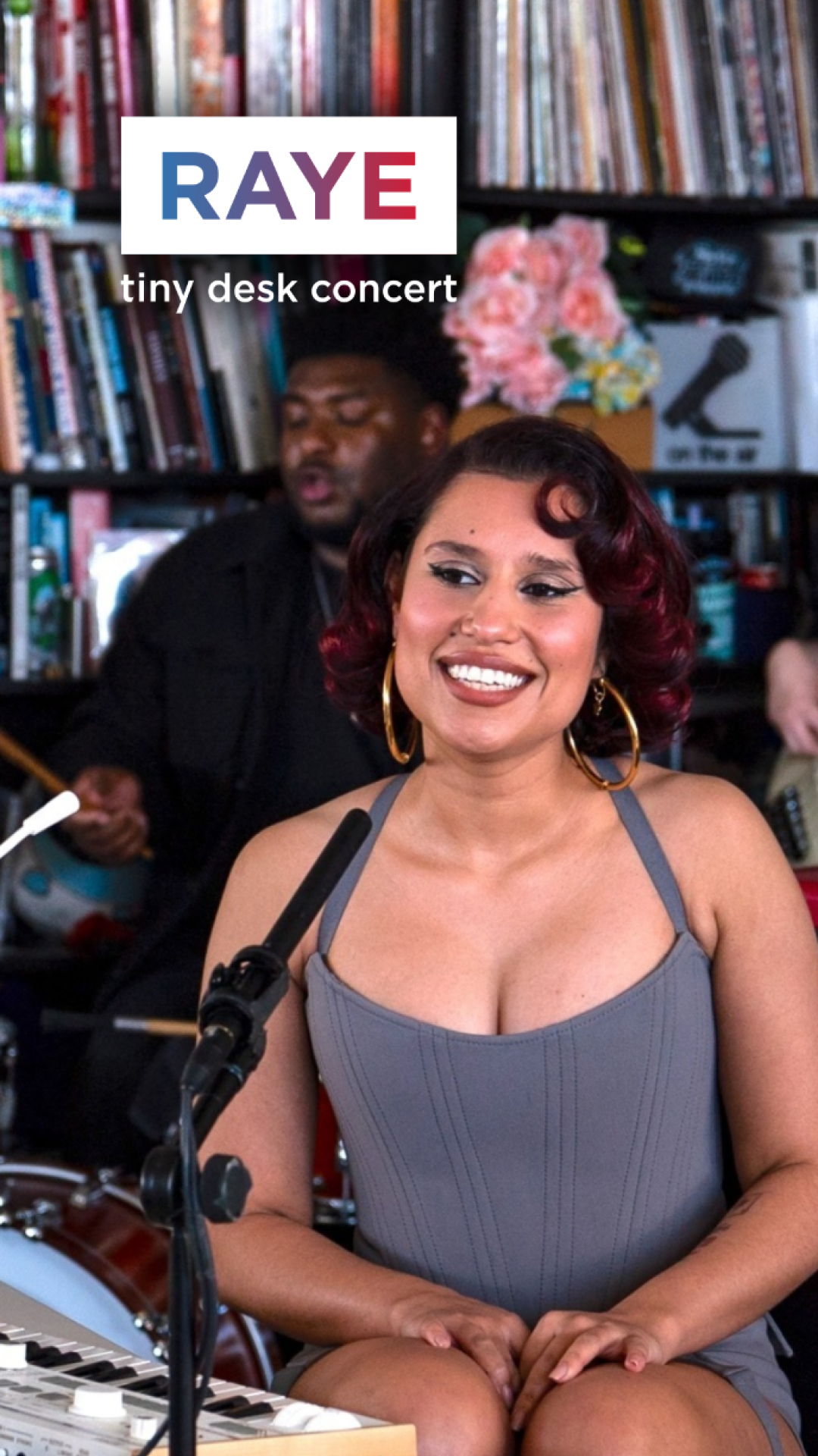
Hosted at Bob Boilen’s desk in Washington, D.C., Tiny Desk Concerts invites artists to perform in a stripped down manner, creating an intimate and authentic experience for viewers.
As one of NPR’s most popular productions, the show is an important part of NPR Music’s mission to spread musical knowledge and connect others through music. The space may be riddled with miscellaneous trinkets, but playing at the desk is a milestone for most artists.
audience
While NPR’s primary viewers are “entrepreneurial” or “influential”, Tiny Desk Concerts has a growing young fanbase seeking raw vocals from their favorite artists in a sea of edited productions.
To appeal to both groups, the branding should be simple yet considered.
visual development
THE APPROACH | silhouette
NPR peels back elements to create a stripped down performance, asking the artist to make the most of a small space.
In the design, negative space can perhaps be that equivalent underappreciated aspect.
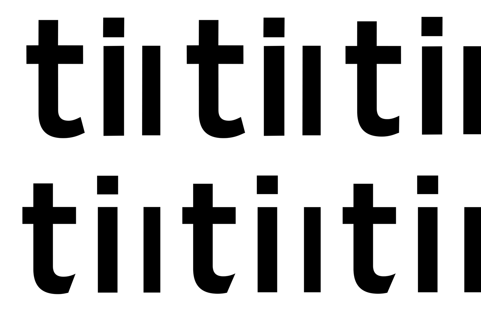
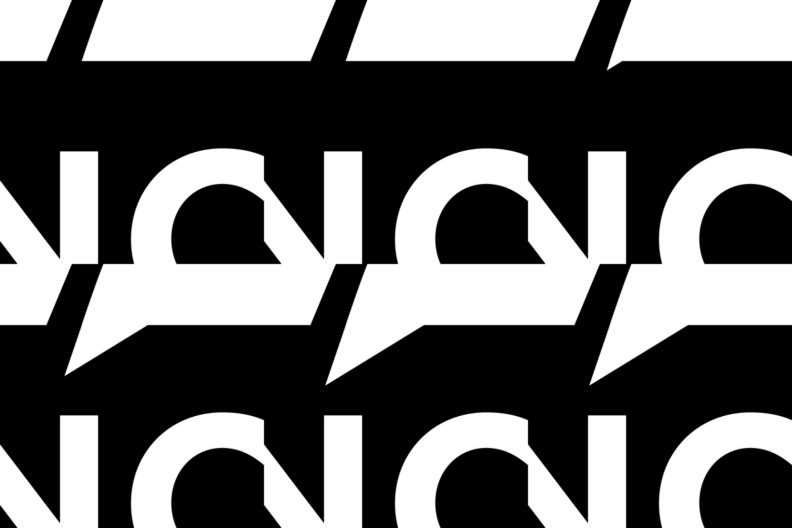
As the show provides room to appreciate the true focus, the alternating high contrast silhouette highlight the very subtle cutouts in the T’s, representing “cutting out” lavish performance details.
Refresh + refine
As NPR sought to frame the artist rather than draw attention from it, the most fitting design was a refresh.
Sometimes simple is best, especially when the brand is defined by authenticity, like honest food made with just a few natural ingredients. So, I further stripped down and modernized the design.
To better balance the ideas of tight containment and “outside the box” performances, The “CONCERT” rectangle holds the words, while the small cutout provides breathing room and depth.
EXPLORATION


CREATING TEMPLATES
The design and animation need to be editable to match each artist’s name, songs, and a particular video’s different production crew.
To do so, I created accessible After Effects files throughout my workflow and ultimately created MOGRTs for the opening, lower third, and ending credits.
As NPR sought to frame the artist rather than draw attention from it, the most fitting design was a refresh.
Sometimes simple is best, especially when the brand is defined by authenticity, like honest food made with just a few natural ingredients. So, I further stripped down and modernized the design.
To better balance the ideas of tight containment and “outside the box” performances, The “CONCERT” rectangle holds the words, while the small cutout provides breathing room and depth.
POSTERS
GOODIES
ANIMATION
Designing with simplicity is a skill, and this project pushed me to learn exactly that. It was an opportunity to practice not only deeply considering what the client stands for but also conveying values with simple, clean design.


